The Tutorial for Conversion of Ordinary Image to Duotone Image


What is Duotone?
Duotone is halftone reproduction of image over the other image or picture by the superimposition technique. Traditionally black color will be superimposed over the color pictures.
Duotone is the generic name for multitone printing, which can be done with two, three or four inks. This process requires that the press be set up with special inks, usually PANTONE-designated colors, instead of the standard CMYK inks used for process color printing. Usually the images are printed with a dark base color and a lighter second color, overprinted to fill in, tint and tone the photo or graphic.
Duotone color mode in Photoshop supports between one to four colors of ink. Because home inkjet printers are far better at printing full-color images than black and white, many photographers and designers use Photoshop Duotone processing to improve their artwork/prints. Photoshop's Duotone mode is also commonly used for creating sepia toned prints, using black and yellow inks, sometimes with a third color.
What is the use of Duotone images?
Duotone is just a color mode which we are using in adobe photoshop. We are using this for converting the color picture in a black shade picture.

Here is some small tutorial based on the duotone images, how the ordinary image is converted in to the duotone image.
The image giving below is the sample of the tutorial showing that how the image was earlier and how will be it after converting it into duotone images.


This tutorial will be really clear for you because i have uploaded the pictures which could easily understandable for you in converting the images into duotone.

Tutorial for Applying a Pinch Curve to Tighten a Layer Mask

Hi friends, so today i saw a nice site tipsquirrel in which i could able to get some nice technique in photoshop. So i thought of sharing with you a nice technique called as pinch curve.
Hope the photoshop viewers may know about this technique already. But still i am giving some nice ideas how can you can adjust the width of the curve layer etc.
If you are using the latest version of photoshop most of us will knowing the technique of Mask panel to make the adjsutment. But if you are not working with the latest version how you can make the adjustment?


For that purpose i found this technique from many top sites and am just reviewing about the topic and giving a small tutorial.


As i told you earlier this tutorial was taken from tipsquirrel site.
The first step is that you have to select the image in which the you are going to perform this pinch curve technique.


So i think that the images given are more enough too understand but even though i should leave my support from my side so kindly follow this step.


With the layer mask selected, goto Image–>Adjustments–>Curves (CMD+M on Mac, CTRL+M on PC).


The resulting image with halo reduced.


Hope this technique will really useful for you while using the older version of Photoshop.

How to Form Text By Combining Photos& Inspiration Videos


Here’s a great little technique that makes use of one of the best new features that Adobe added in Photoshop. It’s called mini bridge and as the name suggests it’s the little brother of the fully blown bridge that comes with Photoshop.
Now I’ve never really been a fan of the Bridge. In CS3 Bridge was slow and cumbersome and although it was improved greatly in Photoshop CS4 it was always a place I avoided visiting unless really necessary.
Mini bridge however is fast, compact and packs just enough power to make it an everyday, usable tool. Not only that but it has a neat little secret which is its ability to drop multiple images onto a document one at a time. That’s the feature that makes this technique possible.
Even if you don’t have Photoshop CS5 you can still create the same look cutting and pasting the individual photos one at a time on to the image.
See this video which will more useful in combining the photos together to form text.

How to Make Background Darker using PhotoshopCS5

Hi viewers today i thought of sharing some interesting tips of making the background more darker than before or vice versa. Actually these photograph was taken from one site and i thought that the background colour black colour was not upto the level. So i thought why should not we make it more darker using photoshop and i did so and now am sharing the photography with my small tutorial how i could able to make it dark as my wish. Hope you all will be eargerly thinking is this really possible. Don't worry just go through this article and find out that it is very easy or not.


The ‘How’ to making a Moody Sky even Moodier
Step 1: Create a Contrasty Black and White Conversion
It’s fair to say that for all of my Black and White conversions I use a plug in by Nik Software called ‘Silver Efex Pro’, however this technique will work with whatever method you use.

Step 2: Blend Mode
Change the Blend Mode of the Black & White layer to Luminosity so that just the contrast of the black and white conversion is left on the layer.

At this stage the effect has been applied to the whole of your image, so in order to restrict it to just the sky all we need to do is to add a layer mask and then paint over it with a brush to either reveal or conceal certain parts. My general workflow is to add a black layer mask by holding down the ALT/OPTION key on the keyboard and at the same time clicking on the New Layer icon at the bottom of the Layer Panel. This hides all of the effect and then using a white brush paint over the sky to reveal the effect but only in that area.

And that’s all there is to it.
This technique is one I use on 99% of my images that include ‘sky’. Occasionally I may apply a little dodging and burning to the sky too if I really want to increase the effect in certain areas but generally this particular technique suffices. The two images below show the ‘Before’ and ‘After’ so that you can see the quite dramatic effect this very quick and simple technique creates.
*Note…The ‘After’ image has also had a little burning applied to the road surface which is how it looked at the final stage.

One last thing….
As this particular photo had a ‘sky’ added into it during the post production stage I thought I’d share this video that I recorded a short while back showing a similar technique to that which I used to do it…
Enjoy

How to Use automatic lens correction in Adobe Photoshop CS5

Hi friends you all will be knowing about the lens operation of Adobe Photoshop CS5. One of the commands in Photoshop CS5 that received a major makeover is the Lens Correction command. It’s no longer buried, rather it sits proudly near the top of the filter menu. Adobe now ties the filter to specific lenses in the file’s metadata. You can even create your own lens profiles with a great utility
We often find that some distortion of the photos. This is because the lens and light. There is a Lens correction tool in Adobe Photoshop CS5, you can use it to correct your photos.

First of all i want to let you know what is called lens correction, why it is used for and where it is used so?
Even though you are really especialist in photography, some time you can also tilt or some distortion takes place in the photography.So dont worry that you photograph waste and dont delete too. You can use this application of the photoshop and you can make the stills properly. This is the main purpose of Lens correction.

Lens corrections can be also used when there are some blurred in the photograph. So still you have a doubt how that we can correct a blurred photograph. For that i have given you a simple tutorial which will make you clear. So kindly follow the steps below to make your blurred photograph into nice one.

Navigate to Filter> Lens correction to open the Lens corrections window.


Photoshop CS5 is getting the ability to automatically correct lens flaws. Several cameras already supported in Photoshop. You only need to select the appropriate model, Photoshop CS5 will correct your photos automatically

Absolutely, you can correct your photo by custom. Move the slider of Remove Distortion can correct Pincushion distortion, move the slider of Chromatic Aberration box will correct the color, the Vignette box can control the light and the Transform box the perspective. You can try them by yourself.

This is the result of using automatic lens correction in Adobe Photoshop cs5.

CREATING EDITING AND EFX

Hello friends welcome to the world of editing ..........everyone is interested in doing editing and animations in the multimedia field. Here we came to know that in past time that editing works,
done in movies is just only ignoring the unwanted or deleted scenes from the movie or sequencing a movie , but dudes nowadays the editing work is not only like that, but it does a various factor in with the help of editing proses and the various editing software..so peoples who are going to read this visual topic are going to see about the various editing software and its techniques and some magical editing trick works done in the multimedia screens and media.
hope u may read this article and be benifited and start doing fine editing works and do some creativity with the exciting softwares.
JUST don be knw only the editing and try to know some visual effect and after effects work on the part of editing .........have a fun , have a professional editing on the 4coming softwares
we are going to see in our TIPS4ANIME page.

Best Review About Photoshop &Illustrator

Photoshop CS5
Content Aware Fill
First, let’s talk about the most discussed new feature - Content Aware Fill. It is indeed a new magical tool. It allows you to quickly remove objects in the image. Back then, you would have to do a lot of cloning and brushing. Now with Photoshop CS5, just create a selection of the object that you want to remove, go to Edit > Fill, select Content-Aware, and it will do the magic for you.


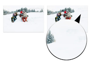
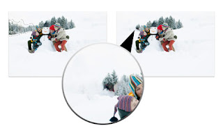
However, the result may vary depending on your source image and how you apply the Content Aware Fill. Because it automatically fill the selection base the content around the selection, it works on certain circumstances but not all. Sometimes you may have to do some manual touchups.
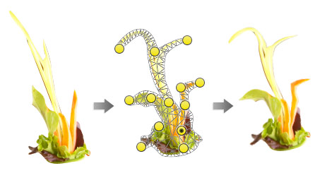
Puppet Warp
I think most of you may probably heard about or seen the Puppet Warp. It works very much like the Warp transform (Edit > Transform > Warp) but even better because it allows you to set points and then warp them. This tool is great for tweaking or straightening objects.


Mixer Brush & Bristle Presets
CS5 introduced a new brush tool called Mixer Brush. Combining the Mixer Brush Tool with the bristle brushes allows you to simulate the effects of real life painting. This tool works even better if you have a drawing tablet.
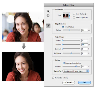

Refine Edge
Refine Edge in CS5 is a big jump from CS4. It has made selecting hair so much easier. You just need to make a selection of the subject and use Refine Edge (go to menu Select > Refine Hair) to handle the tricky selection such as hair. There is an option called Decontaminate Colors which allows you to soften the edge. I tested it on several photos and it works great. Usually it takes me 10-15 minutes to create a perfect hair mask, but with this Refine Edge tool it only takes about a minute.
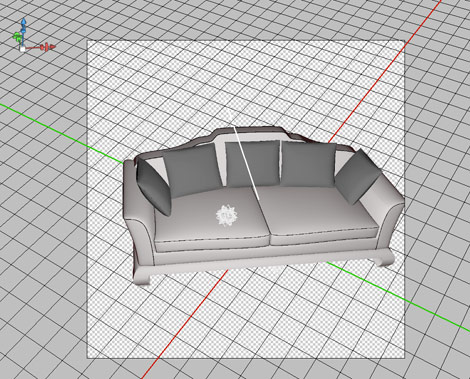

3D Palette
CS5 comes with an enhanced 3D palette where you can edit the render setting such as object and camera rotation without a 3D software. I don’t have any background with 3D editing, but it was fun to mess around with the 3D palette. Go to Archive3D to download sample 3D files. Then open the 3DS file in Photoshop, turn on the 3D palette (Windows > 3D) and have fun with the settings.
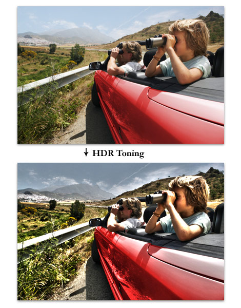
HDR Toning
For those of you who love the HDR (high dynamic range) effect, Photoshop CS5 has a filter for you. Go to Image > Adjustment > HDR Toning, play around with the parameters and you’ve got yourself a HDR looking image. This is a fun tool for amateur photographers like myself.

Drag & Drop Files
Most people focus on the new core features but miss out the minor time-saver features such as drag & drop capability. Now you can drag and drop image files directly onto the Photoshop document and it will automatically import them as an individual Smart Object. This saves a lot of time in my workflow because I no longer need to open the files and copy & paste.

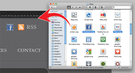
So now I have a preset folder of assets such as icons and stock images for designing WordPress themes.
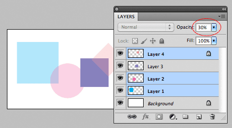
Apply Opacity on Multiple Layers
Another workflow improvement that I like is being able to apply opacity on multiple layers. Just select the layers that you want to change the opacity, press on the number keys to adjust the opacity of the selected layers.

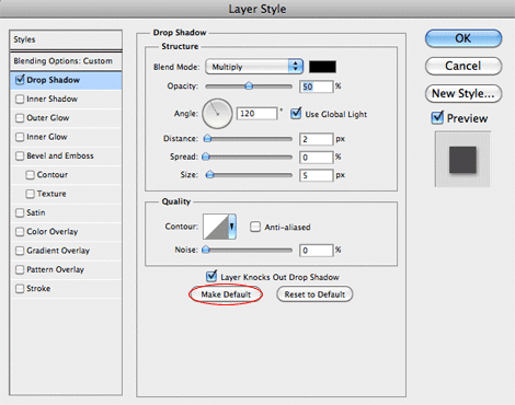
Save Default Layer Style Settings
The last little feature that I would like to mention is the option to set default Layer Style. Now you can assign default setting in the Layer Style palette. This is great time saver for me. I don’t even remember how much time I wasted to change the default drop shadow settings.
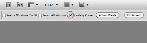

Scrubby Zoom
One thing I hate about CS5 is the Scrubby Zoom, which allows you to use the zoom tool to zoom in or out by dragging left and right. So now you can no longer zoom to specific area by dragging a selection like you used to in the older versions. Luckily you can turn off: select the Zoom tool and uncheck the Scrubby Zoom in the option bar.


Illustrator
Artboards Palette
Illustrator first introduced Multiple Artboards feature in CS4 and the options were very limited. Now you can finally name the artboards in CS5. It also comes with a Artboards palette where you can manage and rearrange the artboards. Being able to name the artboards is a big deal to me. I use Illustrator to design my stock icons. Now I can export my icons (artboards) to different file format without having to rename them.
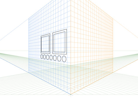
Perspective Grid
I haven’t used the Perspective Grid Tool in any real project yet, but it looks like a cool tool for drawing perspective art such as architect models. It allows you to turn any 2D art into a 3D perspective view and anything that you have inside the grid remains in perspective.
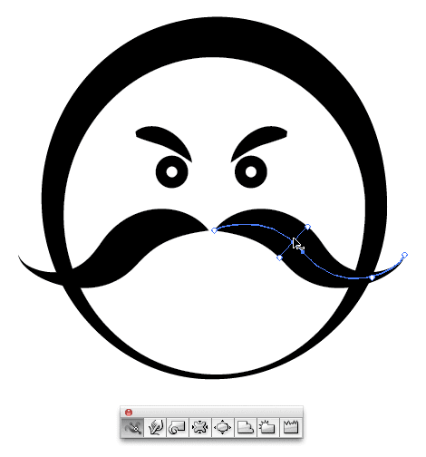


Stroke Width Tool
A new tool that I particularly like is the Width Tool. Back then I had to rely on Art Brush to create comic style stroke. Sometimes the result may not turn out as desire and I have to draw the strokes manually with the Pen tool. With the Width tool, you have full control of how the stroke width should appear.

Drawing Mode
Illustrator CS5 added two new drawing modes: Draw Inside and Draw Behind. Press Shift+D or click on the Drawing Mode icon on the tool bar to toggle between modes. Draw Inside allows you to draw new objects inside the selected object (like a mask) and Draw Behind will draw objects behind. I find Draw Inside extremely useful. Back then you would need to create a Clipping Mask and draw things in the isolation mode.
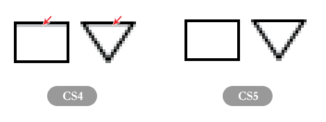
Pixel Grid
There was bug in CS4 that I’ve noticed: if you set the stroke align inside and turn on pixel preview you will see a pixel offset which cause a blurry stroke. To fix this problem in CS4, I had to set the stroke to .999px instead of 1px. I’m so glad they’ve finally fixed the bug in CS5.


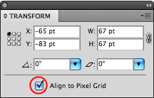
I’m also very happy to see the "Align to pixel grid" option. Now you have option to set objects to align to pixel grid in the Transform palette or when creating a new document. This might seem like a minor feature, but it is extremely useful for creating pixel sharp artwork such as web graphics and icons. They do have "Snap to pixel" option in CS4, but it is only available when you view the document in Pixel Preview mode.
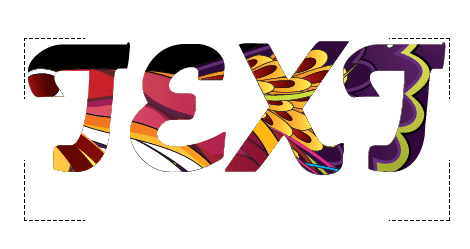
Live Text Mask
Now you can create live text mask. This means you can mask objects with text and the text remains editable. You can either achieve this by either creating a Clipping Mask or using the Draw Inside mode.
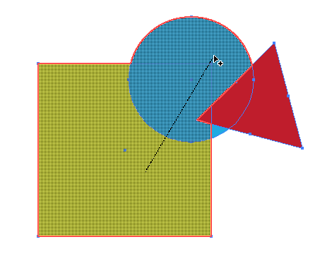
Shape Builder
There is a new Shape Builder tool which I don’t find very useful. Basically it is like the Pathfinders tool where you can merge, divide, or trim shapes with the mouse. Shoot me some tips if you have any great ideas on how to maximize this tool.
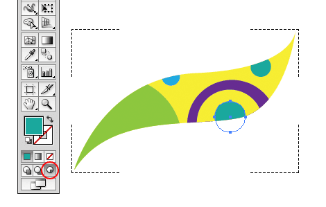
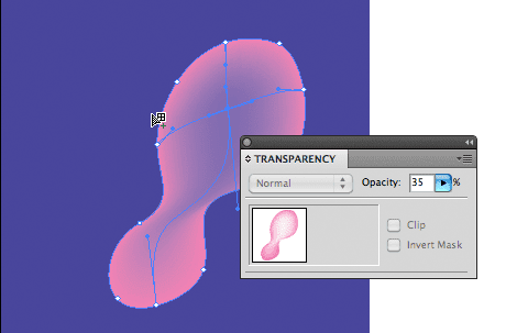
Opacity Mesh Point
CS5 now allows you to set opacity for the Mesh points. This is no doubt extremely useful to anyone who uses the Mesh Tool to create realistic vector art.

Select Object Behind
While I was playing around in Illustrator, I randomly discovered a shortcut which I think is a neat feature. You can select the object behind by holding the Cmd key while clicking on the object (you will see a tiny arrow on the cursor). This is quite useful if you are dealing with a massive shape artwork.

Bristle Brushes
If you like to do vector painting, you will love the new Bristle Brushes in CS5. The Bristle Brushes allow you to create watercolor-like paint strokes. Experience it yourself: in the Brush palette, create a New Brush, then select the brush shape and play around with the settings.

CS Review
CS5 added a new web service called CS Review where you can upload your work online and share feedbacks. It is great for team collaboration. Project images can be uploaded directly from the document (Photoshop / Illustrator).

You can grantx users to access your projects. Users can write comments on the work and those comments will appear instantly in the document CS Review palette.

This can also be a great project management tool to collaborate with clients. Clients can write feedbacks on the design and you can flag the comments as: to do, approved, rejected, etc.

Conclusion
Photoshop
Photoshop CS5 new features are focused on the image editing (eg. Content Aware Fill, Refine Edge, Puppet Warp, Bristle Brushes) and 3D compositing. They are great for the image editors. I particularly like the minor features such as drag & drop files in document and being able to apply opacity multiple layers.
Illustrator
I use Illustrator for almost everything from illustrating to designing icons. All those little features such as Artboards palette, align to pixel grid, Width tool, and Draw Inside are my big time savers.

How to create Wallpaper Using Photoshop


Hi lolz, today am providing you a tutorial based on the preparation of wallpapers from the beginning with attractive effects to. First for doing this wallpapers you definitely need a computer with latest configuration and a Photoshop Cs2 or Cs3. From this tutorial you will learn how to bend the themes and to bend lines and shapes for the pictures with warp tool . Then you can learn how to make glowing effect for the lines which you have bend. Here you can also learn vibrating effect and color effect too. so dear friends this tutorial will surely learn you how to design a wallpaper effectively.In this tutorial i found the best and easy way for learning so i am just providing for you clear reference.

Start with a very, very large screen: 3000 px x 2000 px wide. Draw a rectangle as background for the whole area and fill it with a dark linear gradient layer style. Align that gradient with 45 degrees vertically (sometimes you may change that angle to 90 or 60 degrees). Since the beginning, pay special attention to colors: black and dark violet as base color. The waves colors will match a triad complementary balance with the base color, in our case, the violet-cyan-orange axis.


Draw lines! Many parallel lines (horizontal or vertical, or both!). Group them, duplicate, rasterize, group, duplicate, rasterize… and finally add some blur. In this example I used white as base-color for the line themselves (white is the easiest color to balance and add glowing and other layer styles):


After you reach a wide and tall group of lines, is time for some magic: randomly distort the shape with Warp Transform Tool ( Photoshop > Edit > Transform > Warp ):


One thing you’ll probably notice is the amount of confusing structural lines crossing over the shape; your first attempts are going to be almost trial-and-error, later you’ll get used to this really amazing tool and will master the shapes of Chroma. Don’t worry trying to find the perfect shape so early, things will fit better together when you have more than 5 separate shapes matching a pattern or a familiar shape.

When complete, remember to press the Enter key, or click on the Apply Warp button, on the top. If your computer survives the intense rendering and image post-processing… ;) your artwork should be something like this:


Remember to use the Erase Tool to remove sharpen edges and give the wave a surreal looking. Explore other combinations of shapes, lines, and textures - they’ll enhance your drawings.

If you did a small shape I don’t recommend you size it up or even warping again. The Warp tool isn’t that smart because you’ll be playing with rasterized shapes - not smart objects or vector shapes. If you insist warping the same shape again, your shape is going to get some unwanted sharpen or sometimes blurry edges (depending on your case). To avoid that, I recommend you the opposite way: start with a very large area and a large shape, then size it down. Better results, easier to distort.
Glow, screen, multiply, and other layer styles

When you have the perfect shape, you will need to add its soul, I mean, the layer styles :). Again, open the layer styles panel, and mix Gradient Overlay with Outer Glow styles, and combine them with Screen, or Overlay as layer Blending Mode. A secret hint: when glowing, try using brightly and vivid colors, such as yellow, lime, pink, or cyan, picking the color that is in complementary contrast with the dark gradient we did on the beginning.

To achieve the Chroma effect, I used a gradient fill (yellow to gold), plus the following Outer Glow styles with the following configuration:


Brush polishing

Bring your drawing to life with motion. Add some scattered round dots to simulate speed and movement. Within the Brushes panel ( Photoshop > Window > Brushes, or F5 ), explore the sizing, scattering (with fade), spacing, and pressure:


The big cells are just the way the smaller ones, except the size and spacing. A bit of randomness is really welcome and exciting:


The "range" option in this step is very important - it will give a cellular-looking to the glowing particles - like if they were intensely vibrating:


Poor kid…got any blurry edge? Don’t worry. Use the blur tool and correct that.


Finalizing the drawing

Be creative and fearless to do a complete mess with the shape - in my experience, the messier the better. Size down the area and crop. Draw as many layers as your computer’s memory can handle. Sometimes you won’t be able to merge layers because the effects and styles that were applied. Also use layer’s blending and opacity to give your shapes a translucent appearance.

Our final result, after cropping: