First things first I don’t use Photoshop or ImageReady. I use Paint Shop Pro 10 and Jas Animation Shop to produce animated GIF’s. The principles of animation are the same, I believe, no matter what software you happen to use. For that reason, I’ll try to keep the discussion as generic as possible. The example that follows assumes a file size limit of 512k, but the principles described can be applied to any file size.
Personal Preference
I prefer looping GIF’s. Even GIF’s that are intended to have a beginning and an end should loop, like a movie that runs its course and then runs again. Animations that run their course once and revert to the static image of the final frame may get little attention because the viewer may miss the brief action that occurs early on and isn’t quite sure how to restart the animation. Animations that rely on a simple, dramatic effect don’t work well unless they have the context of a pause or some kind of intermediary frame. Such an animation should be presented with a title frame, followed by the animation, then a fade to black, or white, or some kind of neutral image. Bracketed, if you will. The result, of course, is a loop. So, there are fluid loops (without neutral, intervening frames) and loops with such frames. The example given below is a fluid loop. It is not a fine piece of animation, but it is adequate for the purpose of demonstration. It shows, I think, that a great deal of “movement” can be accomplished with a handful of elements and fewer than ten frames.
From Source Image to Animation
Some element in the source image may suggest the possibility of interesting movement. This is the February 1, 2008 contest source image:
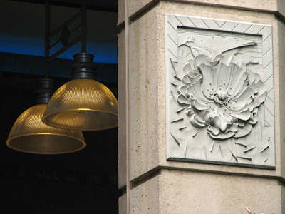
Figure 1: The source.
The shape of the lamps suggested to me some sort of headpiece for an electrocution or scientific experiment from a 1950’s sci-fi movie. I began thinking about a static image with that idea in mind, but as I started to cut out one of the lamps I realized it was suitable for animation. Here is the finished GIF:
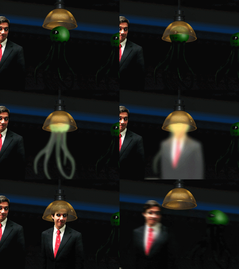
The Background and the Moving Elements
I began by isolating the source element I planned to put into motion:
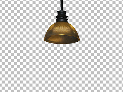
Figure 2: Isolate moving elements in separate layers.
A bit of reconstruction was necessary here to get a complete “headpiece”. The finished element was saved in its own layer.
Next, I cleaned up the background:
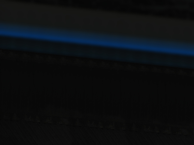
Figure 3: Clean up the background.
This was a very simple cleanup. Other background clean ups can be quite complex. The important point with all animation backgrounds is to do the best clean up needed for the story you are telling. If sections of the background will always be obscured by elements that move only slightly, don’t put work into those sections. In this case, the entire background will be exposed at one point or another.
I imported two externals, each in its own layer:
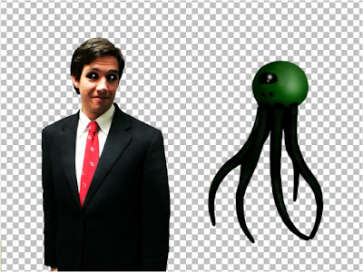
Figure 4: Add external moving elements in separate layers.
At this point I created test frames to make sure the finished product would come in under the 512k file size limit. This also provided a better idea of whether or not the animation would produce smooth movement. The process for creating test animations is the same as that for creating the finished animation. We’ll discuss that later.
Planning the Animation
To achieve a cinematically fluid animation of the selected elements would have required many frames to move them incrementally from one side of the background to the other. At roughly 26 frames per second, such fluidity might have required more than one hundred frames, and would have far exceeded the 512k file size limit. A cartoonish (but nonetheless effective) solution to this problem was to use motion blurs to keep size down.
I created a motion blur for each of the external elements. Getting the right blur varies from animation to animation. Experiment until you get the right look. Start at a 50% blur and increase or decrease the value as needed. I then created a vector layer composed of a line and five intersections to serve as a guide then placed the various element layers in their respective positions.
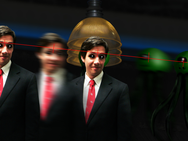
Figure 5: The animation layout.
The lamp posed a special problem because the character heads had to appear to be inside the dome. This was addressed by creating a semi-transparent layer for the two lower lamp positions. In each affected frame one lamp is in a layer beneath the character, while the semi-transparent version is above. Here is the result:

Figure 6: A semi-transparent overlay.
As you can see in Figure 5, three copies of the lamp were created to effect the animation. I took care to make sure all thee were in perfect vertical alignment, because even the slightest horizontal aberration would be noticeable in the finished animation. Once these underlying lamps were created, I made the necessary semi-transparent overlays. Why not make one lamp and one semi-transparent lamp in a layer group and move them when you save the individual animation frames? Because it’s tedious to do it that way and tends to produce errors. The method described here produces a larger working file, but is much more manageable.
All that remained was the creation of the transition elements:
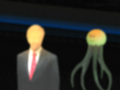
Figure 7: Transition elements.
These elements were created by copying the characters into new layers and playing with the brightness and contrast settings, then applying a Gaussian blur and a bit of starburst. When finished, they were placed at the center intersection line beneath the vector layer.
Putting it together
Once you have prepared your background and moving elements, you can begin making frames. In the example GIF, I decided to begin with the lamp in the uppermost position, an alien on the right, and alien in the middle, and the human on the left. You have to start somewhere in a looping GIF. The aliens, the lamp, and man are all in their separate layers, hovering over the background layer. All other layers are hidden until needed. Creating frames is a simple matter of hiding unwanted elements and exposing elements needed for the frame at hand. I save each composed frame as a separate JPEG image at the native source size of 1280x960. I use a simple, but effective naming convention: 01.jpg, 02.jpg, etc. Once all frames have been saved, I import them into my animation software. Finally, I resize the animation and set the duration of each frame.
Consider the first three frames:

Figure 8: One moving element through three frames.
The first frame is as described above. In the second frame, the lamp and semi-transparent lamp in the uppermost position have been hidden. The lamp and its semi-transparent counterpart in the middle position have been exposed. In the third frame, the middle lamp layers are hidden, and the lower lamp layers have been exposed. The only movement conveyed by these three images is vertical; there is no horizontal movement.
Frames four through six present the transformation:

Figure 9: The transformation.
There is no vertical or horizontal movement in these frames. The animation here is akin to a cinematic fade. In frame four, the solid alien layer in the middle has been hidden, while its bright blurred counterpart has been exposed. In frames five and six, the alien has been replaced with blurred brightened humans, again by hiding and exposing the desired layers.
In the final three frames, we find vertical and horizontal movement:

Figure 10: One frame of "horizontal movement".
In frame seven, the bright blurred human character layer has been hidden, replaced by a solid human. In the eighth frame, the two lowermost lamp layers have been hidden and the uppermost lamp layer exposed. I skipped the intermediate lamp position because I found the snappy upward movement contrasted nicely with the slower descent in frames 1-3. Frame nine represents the only “horizontal movement”—the extreme left and right characters have been hidden, and their motion-blurred counterparts exposed.
Here again is the finished animation:

There is much more that can be done than what is shown in this simple example, and much that must be considered before attempting more ambitious animation. The same skills and art you apply to your static images must apply to the GIF’s you create. Always consider the light source: when objects move, they move in relation to that source; as a result, highlights must change, and so must shadows. Rotating a source element is extremely difficult without perfectly matched external elements or skillful recreation of the source elements as they might appear from different angles. Multiple moving elements with different speeds require complex timing. Consider a head that bobs every third frame while a hand waves every other frame. Multiple moving element GIF’s require a good deal of thought and a naming convention for layers that reduces confusion when saving the individual frames. Perspective must be considered in animations even more so than in static images. Consider an aircraft moving horizontally and parallel to the viewer, then suddenly rolling and moving toward the viewer. That aircraft’s path can be plotted along a vector layer with a line and some dots or intersecting lines. But it must also grow larger as the sequence of frames progresses. You must think about what that should look like and develop your working file and its layers accordingly. And so on.
Keep your first few animations simple and linear. Create a fly moving along a vector horizontally or in a figure eight. As you become more comfortable with visualizing the animation, attempt more difficult projects. Don’t be afraid to abandon something you’ve begun if it becomes clear it will exceed the size limit. If it becomes apparent that your project is beyond your skill set, drop it and try something simpler. Learn to use the liquefy filter or warp mesh (or whatever shaping tools your software offers) to make an eye blink or a mouth smile. Always insist upon the highest resolution. If your animation requires a reduction in resolution to meet the size restriction, you’ll end up with a grainy piece of crap. If the animation is perfect to your eye, but above the size limit, try adding a white border to each frame, then resizing your individual animation frames. Almost all of my animations are 500x375—the same aspect ratio as 1280x960. Work in the native size and reduce to this size, and you should have no difficulties. Practice. Enter your results in competitions. Ask for feedback.

No comments:
Post a Comment